Tom's Midnight Garden

When I draw I often listen to audiobooks, because they provide a long, peaceful stretch of focused time. The only issue comes when my brain slips into thinking about other things and the audiobook steam-rollers ahead, leaving me to come back to the story confused and prone to re-winding a few minutes. Which ruins the peaceful part. My solution is to listen to old children’s books which I know inside and out. These are both comforting and uncomplicated, and I know the stories so well I can drop into them from any point.

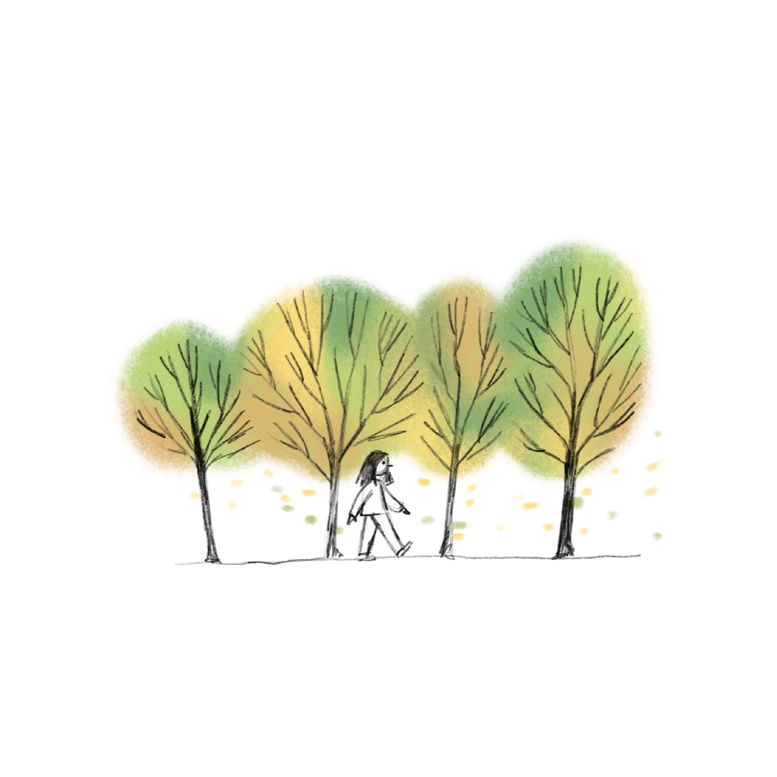
Recently I turned to Tom’s Midnight Garden by Philippa Pearce. It’s such a visual book that I couldn’t help but draw something whilst listening, and I went with drawing a cover. I loved my old copy with illustrations throughout by Susan Einzig, but I also love Levi Pinfold’s anniversary edition cover, which is what inspired my version.

Studio Kura

IMG_6337.JPG

It was never in my plans to do a residency whilst living in Japan, although I have been thinking about residencies for a while now. They always seemed like a great way to see more niche areas of a country, and an ideal way to spend a chunk of time making artwork.

I had heard of Studio Kura before coming to Japan, and was really excited when they accepted my application to spend October on their residency program. I gritted my teeth through a few more months of teaching in Tokyo, and finally caught a flight down to the beautiful rice-studded countryside of Itoshima.

Because of The Virus and Japan therefore being closed to visitors, I was the only one on the residency in October, which was a little sad, but at least I had a huge old house all to myself, and an empty studio to spread my work out in.

This year I was mostly restricted to digital work on my Ipad in Tokyo, so when I got to Studio Kura I lined up my acrylic gouache paints, put my coloured pencils in a cup and set myself the goal of only using traditional mediums for the entire project. This felt quite painful at first - I rely heavily on being able to remove mistakes with a quite double tap - but as the weeks went on I definitely became more confident with painting and how I could achieve the look I needed.

IMG_6338.JPG
IMG_6341.JPG

The end of my stay culminated in an exhibition of the paintings that I had worked on during the month. I presented 8 pieces, all relatively small, that depicted scenes from traditional Japanese folk tales and myths. I gave a small speech and talked through the work with people who came to see it, and it was all very nice and friendly (which was good because exhibiting makes me nervous).

My final week was cut short by a cancelled flight back to the UK and having to fly up to Tokyo again, but I was glad I got such a lot out of 3 weeks. The owners of the residency are very lovely people so I felt extremely well-looked after the whole time. I’d recommend it to anyone wanting to spend some time in Japanese Totoro country to work on a quiet art project.

IMG_6340.JPG
IMG_6158.jpg

Cats and more cats

During the first week of my illustration MA, a few tutors made a wry joke about illustrators who always put cats in their work. Apparently it’s common enough to be met with rolled eyes, which makes me wonder why illustrators and artists are particularly attached to cats. Since my name is Kitty, I like to believe I get a free pass to draw as many cats as I can fit on the page, and so I have cropped a few in here from larger artworks to demonstrate how much I love them. Enjoy ^._.^

Desk cat.jpg
Circus cat.jpg
Edie cat.jpg
FullSizeRender-2.jpg

Covent Gardener Magazine

I recently did an illustration for the Covent Gardener Magazine featuring the Royal Courts of Justice. It was fun drawing a building with such intricate architecture, especially an iconic London landmark. It’s a lovely magazine if you ever want recommendations in and around Covent Garden!

CG.jpg

Christmas Prep

One day I will be organised enough to design some lovely Christmas cards and get them printed and sent out. My grandparents still send out cards to almost everyone they have ever met, but I don’t know many people with that sort of diligence among my own generation. Maybe it’s something that happens with age, alongside a taste for marmalade. Until then, I will just post Christmassy drawings on Instagram and ignore the nagging millennial guilt.

ChristmasCardsmall.jpg

Clapham Common and Dog Walking

Recently, I moved into a lovely house by Clapham Common. The house contains a friendly and lovable dog called Tollie, who is occasionally my responsibility to walk. Having never lived with a dog before, my confidence as a dog walker was pretty low, but after a few false starts (involving Tollie refusing to move and me being glared at by passersby as I tried to drag her without success) we’ve had some pleasant autumnal walks on the common.

In homage to these walks I am working on a new personal project about Tollie and the common in autumn. I’m only halfway through, but thought I would share a few process sketches of character designs and some of the finished spreads. It took me a while to get comfortable drawing Tollie (who knew dogs were so tough to draw??).

IMG_4628 copy.jpg
IMG_4627 copy.jpg
IMG_0536.jpg
6E4B6EEF-54B7-42EB-87D4-928DF64F884A.jpg

Goodnight Mister Tom

Earlier this year my Dad told me that my baby sister had been instructed to read Goodnight Mister Tom by Michelle Magorian for school.

“You liked that book, didn’t you? Tell her how good it is!” He pleaded.

“I loved it. It was my favourite book!” With perfect derision my 11 year old sister gave us both a deadpan stare and then rolled her eyes at our feeble attempt to get her excited about homework. But I wasn’t lying! I loved that book. I went home and found my own copy, creased and dog-eared with ‘Kitty year 6’ written inside the front cover. See? Proof! I only wrote my name inside books that I wanted returned if stolen (or, more likely, borrowed). Books that I loved.

As a 10 year old I was obsessed with stories about tragic orphans and melancholy loners so Goodnight Mister Tom ticked all the boxes (along with A Little Princess and Kit’s Wilderness). It’s still up there with my favourite children’s books, although I’m not sure that my enthusiasm entirely convinced my baby sister. But she recently messaged me to say that she’s halfway through Harry Potter and the Prisoner of Azkaban and loving the series, so that’s enough for me.

GoodNightMisterTom.jpg

Trying Different Things

Although I have a style that I return to again and again, I also like to mix it up and try out alternative ways of doing an illustration. Sometimes I complete the picture and make a mental note never to try that again, but often I end up coming away with a few new processes or ideas that feed into future work.

Since the end of my MA I have had a lot of time to try new things. Mostly I have been focused on revisiting painting, which I have lately dropped in favour of the ease found in digital work. I still don’t feel 100% comfortable with painting, mainly because with ProCreate I can change green to red in seconds just to see the comparison, but I do enjoy the texture it gives an illustration which is much harder (though no impossible) to achieve with digital work. With analogue work there is the depth of the paper grain and the intrigue of water marks billowing across the page, which have a beguiling randomness about them.

IMG_4050.jpg
Owl.jpg

I’ve also been trying a few deviations in style choices as well. Usually as small as a different eye shape or brighter colours, but it’s fun to combine new elements with old to see how they look. It’s funny to think how desperate for a fixed style when I started illustrating, when really being able to constantly experiment and evolve is one of the best parts of the job!

Miu

At the moment I am finishing my first children’s book in preparation for completing my MA. It’s been fun, and I’ve learnt a lot about how to stay motivated on a long project, but lately I’ve been dying to draw new characters and write new stories.

So, for the new week or so, I’m going to put my book aside and work on some new ideas. The first up is Miu and the sleepy kitten that hangs out in her long hair. I’ve done a few style tests and character designs, so watch this space for more.

IMG_3273.jpg
Miu.jpg
Miuscary.jpg

World Book Day Recommendation and Illustrations

Books are the best thing that humans ever invented. Which is why I love the concept of World Book Day and the way that it encourages school children with their reading. When I was in primary school a portable book shop was wheeled into the main hall and me and my brother and sister could choose one book each to add to the stacks we had at home.

This year, on World Book Day, I have finished a book that is one of the most moving and haunting reads I’ve come across in a while. The Cut Out Girl, by Bart Van Es is non-fiction and charts the experience of a Jewish girl who lived in hiding with various families during the Second World War. I really recommend reading it because it’s such a painfully sharp reminder of the wide-spread damage that the Holocaust caused, beyond the parameters of the concentration camps, spilling into the lives of the survivors and their future generations. As I couldn’t get the book out of my head, I illustrated a few moments from the book that stood out to me.

Lien and Kees scooping up tadpoles.

Lien and Kees scooping up tadpoles.

Lien and Mrs. Heroma leaving by bicycle.

Lien and Mrs. Heroma leaving by bicycle.

Jo and Lien fleeing in Ijsselmonde.

Jo and Lien fleeing in Ijsselmonde.

Tiger Process

I’ve been entirely focused on my work for my MA at the moment, and it hasn’t left me much time to do any personal work. But a few weeks ago, before deadlines began looming on the horizon, I drew a young prince riding a tiger through the jungle. This illustration was just an excuse to practice drawing trees and wildlife, plus I love drawing children with large animals - probably because I wish I had a huge cat to curl up with sometimes. I thought it might be interesting to post a few stages of my process, which is something I’m trying to remember to document. For this illustration I drew the initial image in pencil before scanning it in and colouring on ProCreate. There are a few random ink textures in there as well that I created in my sketchbook a while back and scanned in to add some more interesting dimensions - you can see them most clearly in the middle image on the tree trunks. I’m still experimenting with textures at the moment, and sometimes they work, sometimes they look awkward…I’m still working out what I like best.

TIger Sketch.jpg
Halfway point.jpg
Tiger Jungle233.jpg

Coffee and Sketches

I’m well aware that I am a walking art school student cliché, but I love sitting in coffee shops and drawing the people nearby. It’s a nice break from having to think about composition and colour in my usual work - when I draw from observation it’s a lot more automatic and I tend to zone out and stop thinking about what I’m doing. Below are a few pages from my sketchbook post an afternoon in Brick House on Lordship Lane. It was the perfect distraction from the pile of real work sitting on my desk at home.

Scan 2 copy.jpg
Scan 4 copy.jpg

Character Designing

Scan 20.jpg

Character designing isn’t new to me, but if I’m honest I think I’ve never focused on a character long enough to rigorously design it properly. What I mean by that is that I am great at the initial stage of picking facial features, combining them with types of clothing and researching ideas for accessories. But when it comes to drawing that same character over and over and over again in all manner of different poses and expressions, I usually get lazy and move on to something else. Which is where doing an MA in illustration has come in handy - I can’t be lazy if I want a good grade and to progress. There is nowhere to hide from tutors. So, lately all my focus has been on drawing one family multiple times, and I finally feel like my character designing is getting to a place that is a little bit looser and a little bit more robust compared to previously.

Here are a few sketches that I don’t love, but probably best show what I mean, because eventually they will become something that I am happy with:

Untitled-1.jpg

West

I love to read, and having a mother who manages an independent bookshop means that I have access to a constant stream of books picked out especially for me. This year I want to practise designing book covers, so might as well do the ones I’m reading. I just finished West by Carys Davies and it was a brilliantly written book. Her writing style is almost dreamlike, and the narrative switches between perspectives so you get a great sense of characterisation as different scenes play out. So, since I loved the book I’ve designed the cover, and hopefully I will keep it up.

2019

Now that the New Year is here, it seems appropriate to write down some goals for 2019. I figured if I post the list online then I might feel a bit more accountability, and therefore stick to them. So, here goes:

  • Write more consistently on this blog (tracking my progress in my last few months as an MA student).

  • Make more money from freelance illustration projects than in 2018 (currently available for commissions FYI).

  • Complete my final MA project to the best of my creative abilities.

  • Develop at least 12 rolls of camera film this year - a little personal project unrelated to illustration.

  • Collect more children’s books! Mostly for inspiration/partly for the child inside me.

  • Practice more observational drawing.

  • Fill two or more pocket sketchbooks.

Ok, I could go on, but that’s probably enough. I’ll check back in 2020 to see how things go.

Suffragette

I picked up a new book this week by David Roberts, a great writer and illustrator. It’s called Suffragette and contains some beautiful illustrations. I think I’m always more impressed by anyone who uses more paint/ink than digital techniques in their work, particularly in such a huge project!

I’m embarrassed to say that I’m getting a lot of new information about the Suffragettes from this book that I didn’t know before (since the last time I read about them was probably Year Five), but now I’m an expert.

I love the way David Roberts draws characters, and the whole book puts the illustrations alongside the text in a very fluid way. Great stuff.

FullSizeRender.jpg
IMG_1819.jpg

Bookmark

A little while ago Lutyens and Rubinstein (a wonderful independent bookshop in Notting Hill) asked me to design a bookmark aimed at children. I created the design below based on all my favourite children’s classics!

Bookmark_nobleed1.jpg
Bookmark_nobleed.jpg